

The Business Value of Web Design: Turn Interest into Better Enquiries
A potential customer arrives on your website with a question, not an obligation to admire it. They may want to understand a service, compare your suitability with another supplier or find out whether you can handle a particular project. The commercial value of web design begins with how easily they can make that decision.
An attractive website can earn attention. A useful website gives that attention somewhere to go. It connects a clear explanation of your offer with evidence, practical information and an appropriate next step. For businesses, education providers and event teams, this can make the difference between a vague message and an enquiry that starts a productive conversation.
At 360 Design, web design includes custom websites, responsive experiences and e-commerce interfaces. The relevant question for a new project is which customer problem the website should solve. That answer should shape the design, the content and the way success is assessed.
Give visitors a clear route to a decision
Visitors should not need to understand your organisational structure before finding the right service. A company might organise its teams around specialist disciplines, while customers think in terms of outcomes: launch a product, train staff or attract bookings. Navigation has to translate between those perspectives.
A useful service page establishes who the service is for, what it involves and what someone can reasonably expect next. It gives enough detail to support a decision without forcing every visitor through a lengthy company introduction. People with a straightforward question can act quickly; those making a larger commitment can investigate further.
Consider a hypothetical event organiser comparing digital experience suppliers. They need to understand audience suitability, venue requirements and the briefing process. A visually striking homepage with no clear path to those answers leaves the real work to email. A well-structured site allows the organiser to arrive at that conversation better prepared.
Make the offer easier to understand
Good design makes complex information easier to use. Headings, spacing, diagrams, photographs and page structure each influence what a reader notices and how they connect it to the surrounding explanation. These decisions become especially valuable when a business offers something unfamiliar.
The benefit is not simply shorter copy. Removing necessary details can make a service harder to evaluate. Instead, information needs a sensible order: the problem addressed, the practical result, the relevant evidence and the conditions that affect delivery. Technical detail can follow when it helps a buyer judge suitability.
For an education provider, for example, a programme page may need to bring together entry requirements, delivery format and the application route. The design should help a prospective learner compare those facts. Beautiful imagery cannot compensate for information scattered across unrelated pages or hidden in a document that is difficult to use on a phone.
Design the enquiry around the conversation you need
More enquiries are not automatically better enquiries. A form that collects only a name and a message may be convenient, but it can leave a specialist supplier with too little context. A form that demands a complete specification before anyone can speak to the team may discourage suitable prospects.
The right balance depends on the service. An initial project enquiry might ask for the intended outcome, approximate timing and preferred contact method. Additional questions should earn their place by helping route or answer the request. Where a visitor is still exploring, a direct contact option can be more appropriate than a rigid quotation form.
The surrounding copy matters as much as the fields. Explain what information is useful and what happens after submission. Avoid promising a response time the business cannot consistently meet. The website should begin a credible working relationship, with a next step that matches the team's actual capacity.
Make mobile use a complete experience
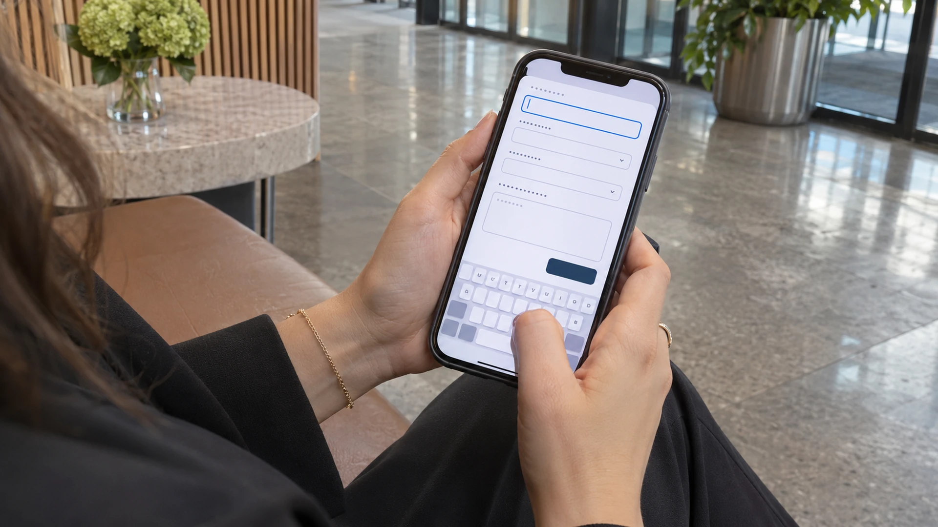
Responsive web design is more than shrinking a desktop composition. On a narrow screen, priorities become visible: which information appears first, whether controls are comfortable to use and whether the visitor can complete the intended task without repeated zooming or sideways scrolling.
Imagine a venue manager checking a supplier between meetings. The service introduction should remain understandable, the relevant examples should be accessible and the enquiry route should work with the on-screen keyboard. A phone version that loses useful context or hides contact details creates friction at precisely the moment interest could become action.
This does not mean every mobile page must be extremely short. It means the sequence needs to be deliberate. Sections should be easy to scan, supporting material should open predictably and essential actions should remain available without covering the content. Test the actual enquiry journey on physical phones, including error recovery, rather than approving a single static mobile mock-up.
Use visual consistency to support trust
A coherent website helps people recognise that they are still dealing with the same organisation as they move between services, articles and contact pages. Consistent type, navigation, image treatment and interface behaviour reduce the need to relearn the experience at every step.
Trust also depends on the details the design reveals. Clear contact information, accurate service descriptions and properly contextualised examples are more useful than unsupported claims of excellence. If an image illustrates a proposed concept, say so. If a project example is included, explain the contribution that the business actually made.
Consistency should not make every page identical. A product catalogue and a consultancy service page have different jobs. A shared design system provides reliable conventions while allowing the content to determine the emphasis. The result should feel purposeful rather than like a template stretched around whatever information happened to be available.
Treat accessibility and performance as practical quality
A website needs to be usable by people with different abilities, devices and circumstances. Clear focus states, meaningful headings, understandable forms and readable contrast help make the experience more dependable. The W3C accessibility guidelines provide a recognised framework for evaluating accessibility; a polished appearance alone does not establish conformance.
Performance is similarly tangible. Visitors notice whether important content appears promptly, whether controls respond and whether the layout moves unexpectedly. These concerns are reflected in Google's Core Web Vitals guidance, but improving them is also a service to the person trying to use the site.
Commercially, these qualities protect the opportunity created by your marketing. They do not guarantee a sale or a search ranking. They help prevent the website itself from becoming an avoidable obstacle between a relevant visitor and a useful outcome. Quality should therefore be assessed through real tasks as well as visual review.
Build for the team that will maintain it
A website's usefulness can decline when ordinary updates become difficult. Service details change, staff responsibilities move and images need replacing. If every small correction requires specialist intervention, outdated information can remain visible long after the organisation has changed.
A practical content structure gives editors appropriate control without making every page a blank canvas. Reusable sections can preserve hierarchy and spacing, while sensible fields make it clear where important information belongs. Editorial roles and approval responsibilities should match how the business actually works.
There is a balance to strike. An unrestricted page builder may offer freedom but make consistency harder to maintain. A tightly controlled system may protect the design but frustrate legitimate updates. The best arrangement is the one your team can use confidently, with enough flexibility for foreseeable needs and a clear route for larger changes.
Judge value through the whole enquiry journey
Page views alone cannot tell you whether a redesign has helped the business. A visitor may read several pages because the content is useful or because the navigation is confusing. A completed form may represent a strong opportunity, an irrelevant request or an existing customer's support issue.
A more useful review connects website activity with what happens afterwards. Which pages attract relevant prospects? Where do suitable visitors abandon the enquiry process? Do incoming requests contain enough context for the team to respond efficiently? These questions link design decisions to operational consequences.
Any comparison should account for other changes. Advertising, seasonal demand, pricing and service availability can influence enquiry numbers. Agree on a baseline before launch where possible, then review both behavioural evidence and staff feedback. Improvement should be demonstrated cautiously rather than attributed to the redesign simply because it happened first.
Spend where the website creates the most leverage
A custom website does not need the largest possible feature list to be valuable. A focused service business may gain more from clearer explanations and a dependable enquiry route than from an elaborate animation system. A retailer may need product discovery and checkout improvements before a visual refresh of secondary pages.
Scope should follow the friction you are trying to remove. This helps distinguish necessary work from optional enhancements and gives the project a defensible order of priorities. It also makes phased delivery possible: address the most important journey, learn from its use, then extend the experience where evidence supports the investment.
Discuss ongoing costs alongside the initial build. Hosting, content updates, technical maintenance and third-party services all affect the usable life of the website. A lower initial price can be poor value if the result is difficult to operate. Equally, an expensive platform is not justified merely because it is sophisticated.
Connect the website to daily operations
The enquiry journey does not end at the confirmation message. Someone needs to receive the request, recognise its subject and respond with the right information. Design work should therefore include the handover between the visitor's action and the team's routine, even when the integration is as simple as a clearly structured email.
A useful review asks what happens when the usual contact is unavailable, an attachment is too large or a visitor submits incomplete information. These ordinary situations reveal whether the website supports the service or creates another administrative queue. They also help decide which automation is worth building and which steps need human judgement.
There is no need to automate every exchange. For a consultative business, a personal response may be part of the value. The website's role is to preserve the context of the request so that the next conversation can begin with the customer's actual objective.
Start with the result your business needs
The most productive web design conversation begins with a specific difficulty. Perhaps customers cannot distinguish between services, mobile enquiries are cumbersome or the internal team struggles to keep information current. Each problem suggests different work and a different way to judge the result.
360 Design can discuss those needs within a website project that brings content, structure and interface design together. Bring the pages or customer questions that are causing friction, along with the outcomes your team wants to improve. A clear starting point makes it easier to identify a proportionate scope.
If your website is attracting attention without supporting the next step, contact 360 Design. The aim is a website that helps suitable customers understand your offer, make an informed decision and begin the right conversation with your team.
Elisha Roodt
Founder and Digital Pioneer at 360Design.org. Leading groundbreaking innovations across Web Development, Virtual Reality, Augmented Reality, 3D Renders, and AI since 1998.


